


Thriller Album Cover: Cover Redesign
Project Created: 2023
Thriller 25 is the 25th-anniversary edition reissue of Thriller (1982), the sixth studio album by the American singer and songwriter Michael Jackson. The original album sold 70 million copies worldwide, making it the best-selling album of all time.
Projects Purpose
For this project, We got to choose an album cover to redesign artistically, and I selected Michael Jackson’s Thriller 25th anniversary edition to create a stunning album cover design. The objective is to redesign the original cover from scratch, transforming it into a unique piece inspired by the original cover.
Target Audience
The ideal listeners for the Michael Jackson’s thriller album would be around ages 15 - 28 and are interested in theatre, or movie/book genres that have a lot of action, horror, and drama scenerios
Research
Michael Jackson Covers

As I was did my research on Micheal Jacksons album covers, I wrote down some details that I should add onto some of the Covers I made. Something I noticed was a lot of his album covers has himself as the main focus, but the background is always in an outdoor environment, and usually at night, so that was helpful when I created the album covers.
References

These photos served as references for several of my designs of the album covers. I researched more about the costume design, and zombie make-up, to ensure my work remains tame, and not too grotesque.
Early Stages
Mood boards & Character Styles


With the mood board, I decided to go for a classic movie mood board, because Michael Jackson’s music videos reminded me of old school movies.
The next one is Bogie books, which is a vintage halloween style that was popular in the 80s to 90s. I went with this style because it was halloween at the time, but also because thriller released in the late 1970s, so it makes sense.
Lastly, the sequential mood board relates to a comic book theme, and I chose this theme because Michael Jackson loved comic books, so I decided to go with that style.
Color Palette & Font Choices


The color palette was used for the final Album cover, while the fonts are used within the main 6 album covers I created.
Creating the Album Cover
Sketching out ideas


When I created these sketches, I based them off the mood boards. There was many ideas that I was interested on turning into a album cover, but I felt like I wouldn’t be able to capture it perfectly like how I’ve thought it out, so I ended up doing 2 albums from each mood board.
At the same time, I didn’t know how to design faces on Illustrator also, so I didn’t choose the sketches that had realistic faces, because I was learning how to create stuff on Illustrator for the first time. I only managed to make the zombies look good, because you can make them look cartoony, and they’ll still look good through design.
Round 1 Drafts
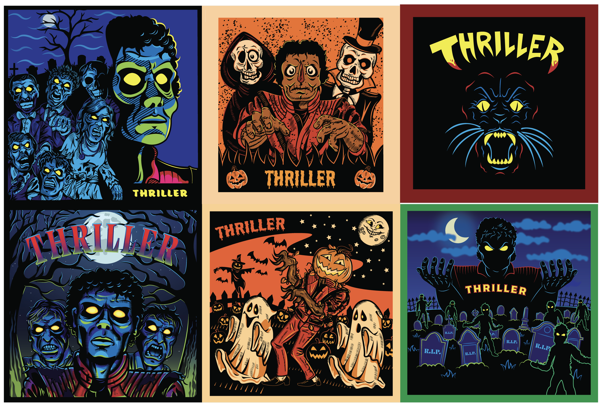
When I created these 6 designs in 2023, I didn’t know how to create proper color palette's so I ended up using the default colors from Illustrator to use for a majority of these album covers. Another thing was, we had less time to work on these, so I rushed some out like the bottom right one, which is the reason why its lesser detailed from the other ones
Round 2 Drafts

After 2 years, I made significant improvements over my previous work, with many of the album covers getting a make-over giving them a cleaner look to the originals. I also gave some of the Album covers some minor improvements like the werewolf one getting more details, along with the one underneath also.
Final Album Cover


This is the final Album cover I went for, I feel like it captures the type of album covers that Michael Jackson went for, with himself in the center, while there’s a scenery in the background. I also created a Vinyl to go along with the Album cover to complete a full set.
Mockups


Reflection
This was the only project I chose from 2023. While there are some other ones from 2023 that I could of used, I decided to go with this album cover one because it seems like the best option for a portfolio, while the other ones seem like for fun. I enjoyed improving the color palette from the default one, because it makes the design look better.