


Gaming Boost: Creating a Magazine
Project Created: 2024
Gaming Boost is a brand that manufactures magazines for gamers. This magazine has the news from 2024, which includes stories that relate to the gaming industry around that time.
Projects Purpose
The projects purpose was to help us create a magazine that helped out with typography. We were allowed to choose our stories, and theme, but we needed to practice our skills with Typography. I decided to create a gaming magazine called “Gaming Boost”.
Target Audience
The audience for Gaming Boost, are individuals who love video games. The audience can range from kids, to adults. They love seeing the latest news on gaming, whether its reviews on a recent released game, or if there’s any issues with the release of a video game. The magazine is for everyone who is interested in gaming news.
Research
Color Palette & Font Choices


The color palette is based on the different logos I created for the Gaming Boost Magazine. The font choices are used throughout the magazine for titles. subheads, etc.
Designing Assets
Sketches

These are some of the sketches I created for the magazine. The unique thing about the magazine is, each page has a different theme to it, and I created different sketches that would best fit that theme. For the 1st story, the theme is old school, so the video game characters are designed to be “Hanna Barbera” styled, so it fits with the theme of the story.

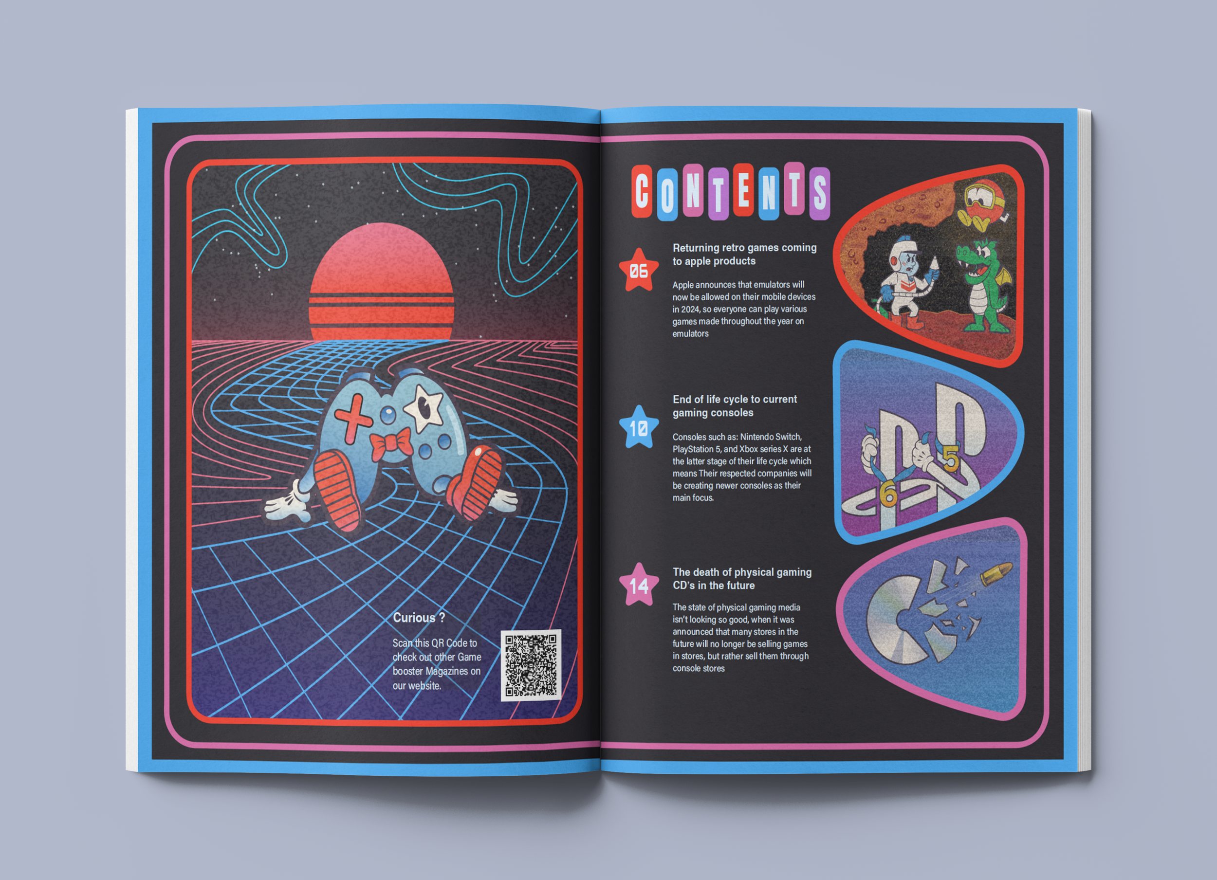
Here you can see some of the pages themes. The front, I’d say I went all out when creating this magazine because each page would feel unique from one to another. Some of the sketches are missing, but I also sketched out the end pages, but they aren’t shown on here.
Logos


When I created this logo, I wanted to create something simple, but in some way, it should represent gaming in some way, so I changed the 2 O’s into a gaming controller, and that did the trick.
created different variations of this logo, with colors I believe would work for a gaming magazine. I ended up using the light blue one because It wouldn’t blend in with the front cover design.

These are logos I created for the story pages. Since I wanted each page to be different in some way, I also made the news logos to be a bit different also to fit the theme of the page.
Character Designing

These are the character styles I went with throughout the magazine. Since I drew existing Video Game characters on some of the pages, I needed to find a way to create some original designs. I decided to use these styles, so there’s a bit of originality when designing existing characters.
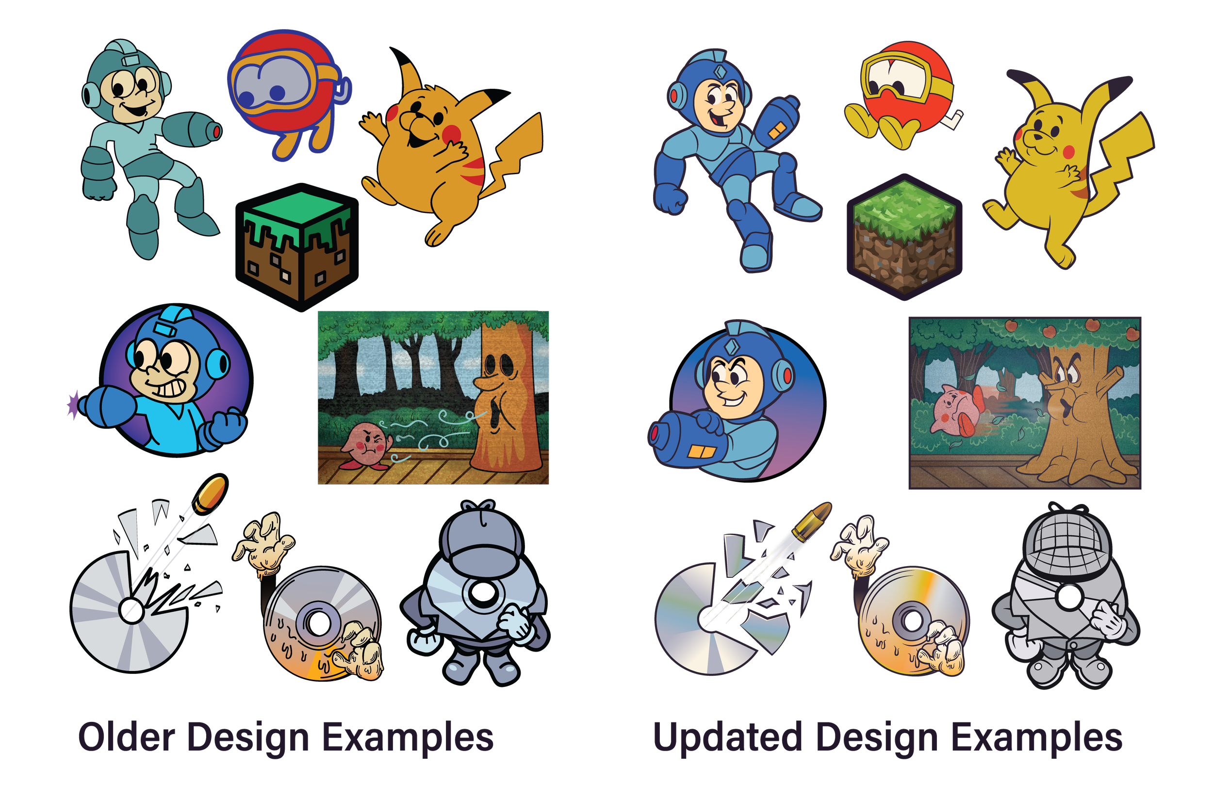
I recreated a majority of the assets from working on this project last year, because they were outdated. When I redesigned the assets this year, I was impressed on how much I’ve improved my design skills throughout the span of a year.
Mockups


Reflection
Out of all of the projects, I really loved working on this one the most because of all of the details I added onto the magazine. From the character art, to the page designing, I really improved this project a year later. When I created this magazine at first, it was when I was first learning typography, so a lot of the text wasn’t centered properly, and I needed to revise most of the spacing. Overall, It was a fun project to have worked on